Social media advertisement plan for Phizzwizard
Here is an advertisement from facebook posted by Pepsi
It is a simple photo of their drink with a phrase with some wordplay convincing people to try their drink if they have not recently. Throwback thursday is when people do something to remember the past and this brand are insisting that people try pepsi again.
For our own social media advertisement, Our plan is to produce an image which connotes to our campaign advertisement. The plan is to present a very simplistic yet affective comedic ad with a shoe that has strawberry laces. This relates to our campaign of living young and having more energy as within our video ad we plan to use this shoe with strawberry laces to connote to our campaign.
Proposal
The overall proposal for the campaign is set to promote the drink "Phizzwizard". this is set to be targeted at a younger target audience as well as an older audience. The focus of this drink is the unique strawberry flavour as well as the drink itself being red in colour. The Idea of Phizzwizard represents for our campaign energy and speed. Therefore it has a big role in our campaign as it allows us to recognise who we should be promoting to. The "Wizard" part of the name also does this as the idea of the drink is how you become amazingly energetic like magic and are more physical because of this drink. The main target audience of the drink will be children of the ages of 13-18, the secondary audience will be aimed for adults of 30+ as this allows us to cover a wide range of people who likely will care more about their health because they are younger.
The overall target audience has been set at these two specific age categories to be able to appeal to a wide range of audiences as children love fizzy drinks however older audiences will also be appealed to the drink as they have grown up with past canned drinks therefore they are more likely to purchase our drinks.
Concept
The plan for our advertising campaign is going to be to produce a wide range of marketing materials for the public. These materials will include a billboard, magazine advertisement, video ad and finally a social media ad. These advertisements will be planned properly however will not be going into production. Each part of the campaign will include specific material that is relevant to the campaign itself. E.g The inclusion of strawberry laces to refer to the strawberry taste.
Firstly there is the billboard. The plan will be to have the iconic "Phizzwizard can sitting on an astro field in a low POV shot. The general theme of the advertisement needs to follow our campaign idea of how fitness is promoted and energy can be taken through the drink. The can itself promotes to both a younger and older target audience due to the bright and vibrant colour scheme of the can as well as the actual usage of a can appeals to an older target audience as older audiences can relate cans to their past experiences with energy drinks, therefore this becomes iconic and appealing to them. Following on from this, the magazine advert will be following a very similar convention scheme. However with the magazine advertisement we plan to target the older audiences as typically younger generations use social media as a source of media where as older audiences uses magazines. On top of this we will try to promote the idea of the can being iconic more in this version of the advertisement by giving it more room to stand out.
Following this is the video advert, like our other advertisements the plan will be to feature the drink as this amazing energy drink which gives anyone who takes it the energy and power needed to run a race. The advert is set to be about a competitor in a race who is feeling stressed out and worried about the race. They are given the energy drink by a supporting fan and they proceed to drink it. Once they drink it they feel super powerful like they can take on the world. And from this, the race begins. Once the race begins the competitor begins easily beaten his competitors and wins the race with flying colours. However in reality the race begins and the competitor is just drinking the Phizzwizard and eating strawberry laces to connote with the flavour of the drink. The younger target audience will like the idea of the advertisement as its humours them but also gets to the point of how the drink can make you feel energetic and powerful which is exactly what younger audiences want. The strawberry aspect of the drink is also shown in a comedic humour as the competitor is just eating strawberry laces in a almost rabid way. Finally the older audiences are targeted through this advert as it encourages them to care more about their physical selfs and give them energy through their day as a competitor to something such as coffee.
Finally there is the social media advertisement, this is going to follow a similar convention scheme to the billboard and magazine advertisements however the plan will be to adapt it to social media platforms by making the promotion very clean simple and neat to promote the flavour of the drink and the brand itself. The plan will be to have the drink can as the main image on the promotion with a layer of strawberry laces covering the top of the can to promote the brand and flavour. The social media advert will more specifically focus to the younger audiences due to the demographic of users on social medias such as Instagram however still will appeal to older audiences through the idea of being iconic as well as an energy drink which can help you through your day.
Target audience
The target audience for the drink is primarily 13-18 and secondary being 30+ years old. The powerful presentation of energy where as the actual usage of a can for the drink itself promotes itself to an older audience as it creates nostalgia due to most drinks from their childhoods being made in the same form, this means people will be willing to try out the drink due to the nostalgicness. The younger audiences will be more likely to try the drink due to the high vibrancy in the colour scheme of the bright red as well as the idea of strawberry laces being sweet and enjoyable like the candy appealing to young kids. These two audiences are key to the brand as it allows for a much wider audience to be targeted.
Genre
Because he drink is targeted more directly at a younger target audience, the plan will be to use a more comedic approach to the scene by making goofy and fast cuts to the advert for example as well as using funny transitions. Also at the end of the scene the wake up part is meant to appeal to this. However the idea of completing the race and becoming the winner will appeal to the older 30+ audience as they value the scene of winning and gaining something out of the drink.
Resources and personnel
One example of the personnel that will be used within the campaign will be an editor. This is an important role within our video advertisement as in order to create a comedic scenery we need to have a specific form of editing being created. Such as rapid shots to show a goofy outcome to the scene, as well as a dream transition to present that the race never actually happened. Another example of personnel would be the videographer. This is because they are required to be there in order for specific shots and photos to be taken to use in all the forms of the advertisements. (Billboards, social media) One important example of resources that needs to be accounted for is the camera. This is important so that you are able to take and create all the videos and images you need for the campaign. Another important resource that is required will be the usage of softwares such as Final cut pro, this will be needed in order for the editing process to take place properly.
Form
The plan will be for the product to daily be advertised on social media predominantly. The reason for this is because through the brief it is stated that we must target ourselves towards teenagers of 13-18. Therefore the biggest social media platform that we can do this on would be social medias such as Instagram. Having our adverts promoted on different forms of social media will allow for the campaign to gain popularity at a much steadier pace. The way in which we use our advertisements will whiles mainly target younger audiences need to also target older audiences as well. Because of this, we plan to promote our video advertisement on TV as older audiences will typically see this as its their main source of promotion. This wold also therefore help promote the overall customer brand of the Phizzwizard drink.
Colour Scheme
The planned colour scheme is made to follow the actual flavour and colour of the drink inside the can. The flavour is promoted as strawberry laces and colour of the drink is crimson red. Because of this we will be using the colour scheme of a bright red as well as usage of white, black and some green to follow with our promotional video. We will be taking the major target audience of 13-18 into account here by using the primarily vibrant colours to become appealing to those audiences as well as secondary audiences by using more calm colours such as green to relate back to nature and the pureness of the drink, showing you can trust and rely on it.
(M2 U20) justify the choice of planned components by targeted media sector)
The reason that for our Billboard advert we chose to have a big simple font and colour scheme along with the Phizzwizard can is to be able to create a wide and attractive branding. The reason our Billboard has been chosen to be presented in this format is to be able to be seen extremely visibly and therefore be seen by more people who are driving along in their car / vehicle. The reason we have chosen to use the colour scheme of a orangy red can followed by clear white font is because it represents the selected flavour of the drink that Carter soft drinks has created. This flavour was shown to be strawberry laces and also mentions that the drink inside the can is coloured red. Therefore to connote the flavour and theme of the drink it was in our best interest to make sure the colour scheme went with the flavour, otherwise it may seem misleading to our primary target audience of 13-18 year olds and uninteresting to a secondary audience of 30 year olds. The simple and clean billboard applies as well to our secondary audience as it makes our advertisements quick and easy to read and therefore is catchy to the eye. This means that people of both audiences are more likely to like the advertisement and remember it. As well as this Carter Soft Drinks states it wants older generations and retro audiences to recognise the symbolism of the cans they used to have when they were younger, through big billboard advertisements they should be able to also achieve this easily.
For our social media advertisement, our plan is to make a very clean and simple advertisement that typically connotes and follows the same theme of our other 3 advertisements. This being clean and simple allows for people who view social media posts to notice the advertisement easier and be more interested in it. We have also included online in the social media advertisement a slogan "Fizz for you". This creates a memorable interraction with the target audience of 13-18 year olds as it gives them a catchy slogan to remember. As well as this because the target audience is so young using a clean and vibrant advertisement can be seen as really attractive to them. Referencing back to the brief it specifically states that it wants to age itself at 13-18 year olds predominantly. By using social media to do this we will be able to emulate the advertising that Carter Soft Drinks needs from us.
For our video advertisement, We have structured a plan for our video to be themed in a retro 80's theme. This can relate back to younger audiences of 13-18 and our secondary audience of 30 years old as by including a range of high vibrancy colour which we have chosen to present in the form of an athletic race. The reason we have chosen to base our campaign around this idea of athleticism is because of the core idea of the drink being energetic and powerful. The Idea will be to have a race take place and one of the competitors is worried about the race. Someone will pass them the can of Phizzwizard and they take the drink. This gives them a burst of power and energy which ends up making them dominate the competition and win the race. However in reality the race never began and the competitor instead is sitting on the floor eating strawberry laces to relate to the flavour of the drink as well as colour scheme and colour of the drink. We chose the create the colour scheme of red white and green as the colours relate the the main aspects of strawberries. As well as this the colour scheme of Green relates to nature which further presents the idea of power. This is because it presents the idea that Fizzwizard is high in energy and will also allow you to be more active due to the sugar contained inside the drink. The reason we have chosen to create a video advertisement in this way is to be able to create a name for our product as a drink that is athletic and tasty. Following the retro theme this will also therefore connote to our target audience of 30 year olds as it can relate to things they used to do as teenagers such as bowling. With doing this Carter Soft Drinks should be able to see that our business is able to understand a wide variety of advertising strategies and platforms for them to use for their new drinks and therefore hopefully choose us.
Finally, for our magazine advertisement we have chosen to present our drink in an ice cold beverage form. This is to ensure the refreshness of the can and tastefullness is there and presented properly within the magazine advertisement. Following this, the reason we have chosen to use clean and vibrant colours within our magazine is to follow the connotations of the other 3 advertisements. This creates cross promotion within all our products and advertisements as they are all advertising in the same format to create brand recognition upon seeing the advertisement. This means that our target audience of ages 13-18 are more likely to be attracted to the drink and the advertisement, following this on this will also help attract our secondary audience of 30 year olds, this is because by having a clean and simple advertisement, we are allowing older generations to feel a comfort to the formality of our advertisements. To relate this back to the brief. We are specifically asked to be appealing to ages mainly of 13-18 but also an audience of 30. Typically both audiences are likely to use magazines to be able to see whats going on and what is new and about. So by advertising ourselves with vibrant colours and catchy slogans in magazines will allow for us to meet the brief and create a strong magazine advertisement.
(D1 U20) Discuss the legal and ethical constraints within the planned campaign
Ethical Issues
The first constraint being presented is offensive language. We need to ensure that within our promotional advertisements wether it be a social media advertisement or video advertisement that there is no forms of racism or sexism against anyone within the advertisement. This is to ensure there is a wide range of diversity and equality among everyone. The way we will ensure that this constraint is being fully followed is by making sure that when we create our pieces of promotional media we are also carefully checking and evaluating our advertisements for them to not be misleading offensive or harmful. The reason we must avoid this constraint is so that we arent taken into account for presenting harmful and offensive language with regulators such as the ASA who regulate advertisements to ensure the advertisement is not breaking any of their regulations.
The second constraint is ensuring there is no presentation of bad imagery. We must ensure that the usage of any forms of inappropriate images and representations of individuals is not presented. This means things such as inappropriate sexual imagery, and violent imagery. We must ensure that our advertisements are also showing a positive representation of children as they are an essential part of our advertising campaign and target audience. The way that I plan to ensure the constraint of bad imagery is prevented is by carefully evaluating what we are kind of message we are sending to our audience. We will carefully use regulations to evaluate our advertisements and imagery so that we have nothing ethically wrong or harmful. The reason we must do this is so our products and advertisements do not represent our business in a bad way as well as our image.
The penultimate constraint is providing an honest product. We will ensure that we as the product creator are presenting an honest product to our customers and audiences. This means that within our advertisements we need to be ethical in the sense we are not lying or misleading our customers into thinking our products are something that they are not. The way that we will ensure this constraint is fulfilled is by carefully ensuring that all our statements are factually true. Such as if the drink is healthy or not or if it will give you energy. We must avoid being misleading and lying as it is unethical to mislead a customer into purchasing something they dont want. As well as this for the business its a bad brand image to be lying and misleading customers and potential investors.
The final constraint that we must be following is the use of swearing. This cannot be presented through our advertising campaigns. This is because our primary target audience is 13-18 and although its likely 18 year olds are ok with it, parents will likely not want their 13 year old children hearing swearing and therefore will forbid them from watching the advertisement. The way that we plan to avoid the usage of aggresive language or rude language is by ensuring that each individual in the advertisement has been properly informed and introduced to the script for the ad and knows exactly what they should be doing and when they should be doing it. The reason we do this is so that the entire group of people working on set understands the constraints we must follow and that we need to ensure the regulations set by the ASA and our company our met in order to properly target our audience of 13-18 year olds.
Legal issues
The first legal constraint is to not obstruct any copyright laws. Legally we must ensure that the advertising campaigns of which we create do not obstruct any copyright laws that have been made with branding and advertisements. This essentially means that we are ensuring that our advertisements and pieces of media produced are stated as our on work. This means nobody can take it and it is ours. This is the same for other businesses, we need to ensure we arent taking any risks of copying other businesses work. The way that we plan to avoid obstructing copyright laws is by checking our products and materials thoroughly to ensure that we are not breaking the law as well as have created unique products and advertising materials. This ensures that the advertisements we have made are unique and therefore interesting as well.
The second legal constraint we face is recieving permissions to film where we need. We must conduct getting land permissions for where we can film our advertisements or just put them. When we are creating a video advertisement for our campaign if we are not careful and ensure that the area we are using we have been given permission to use, we could accidentally be fined for filming in this area and therefore have to pay for it. The way we plan to avoid being denied access to film on land is by directly contacting the owners of the land which would likely be the council of the borough and reassuring them that we are only using the area to film an advertisement which will cause no harm. The reason we must do this is to prevent facing legal issues against the owners of the area, as if we are to film an advertisement in a location which we havent got permission to, then we can be sued for using their private property / owned land.
The third constraint we will face is legal documentation being signed. When conducting an advertising campaign, specifically for the video advertisement you must ensure that everyone who is working on the set has signed a talent constent forum. This is done to ensure that everyone on set understands what they are doing, why they are doing it and has set times they need to be places. This ensures that the business doesnt face any random charges from someone working for them for being worked too hard. The way that we will avoid people sueing us for in work injuries is by ensuring that before people start working on our productions and advertisements they sign talent release forms, these will be used to ensure that the individual knows what they are signing up to. This must be done so that we as a business can completely avoid taking responsability for other individuals being injured on set.
One final legal constraints is that we must ensure that we dont obstruct or are being misleading. This is because when creating an advertising campaign businesses tend to want to make their products stand out therefore they need to create unique slogans and advertisements. One good example of a misleading advertisement is the "Redbull gives you wings slogan" as it literally cant give you wings so its misleading and missinformative. Therefore the slogan faced hate for this. The way we will avoid creating misleading slogans such as this is by ensuring we take a detailed amount of time with our editors to create a short simple and catchy slogan which gets straight to the point of the product. The reason we have to do this is to avoid complaints from the public or being sued for producing false advertisements to the public and therefore selling false products.
(P3 U20) Create a pre-production plan for the media components in the planned advertising campaign
Competitors Drink Advertisement
For our product which is called Phizzwizz, it is a phizzy drink made for mainly 13-18 year olds but also targeted towards 30 year olds. Because of this we need to be able to evaluate a good way to establish a connection between both audiences and therefore have a mix of that be represented on the can. A good way to do this will be to look directly at what our competitors have been doing with their branding and conventions for advertisements.
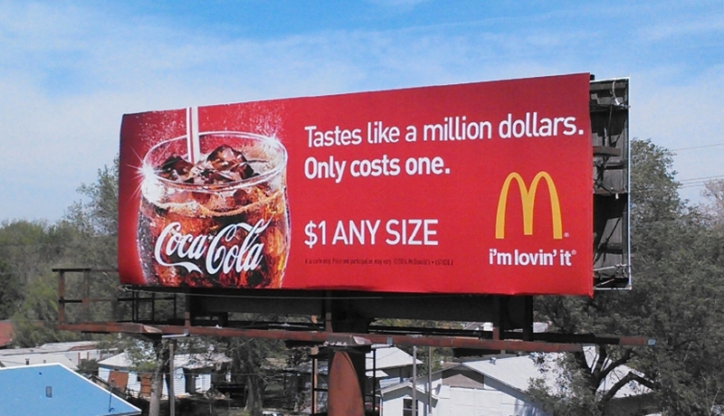 A good example of a business that has used their branding affectively within their advertisements is Coca Cola. Coca Cola is one of the most popular and iconic brands of the 21's century and is pretty much known by everyone. Here is a Billboard advertisement that has been created by Coca Cola to be able create wide scale awareness. This advertisement in particular is a partnership between McDonalds as Coca Cola is an essential asset to McDonalds branding. Coca Cola also tend to keep their advertisements simple by following their colour scheme of red and white whiles also using a simple font for their sub texts but a more stylish font for their actual branding. For Phizzwizard to be able to reach a level like Coca Cola has, they would need to be able to keep up with the amount of advertisements such as these Billboards being presented. Also the usage of clean and simple text allows for their advertisements to be seen from far away, therefore making this advertisement more affective. The conventions of the Coca cola advertisements that have been presented on this billboard is following a very simplistic yett affective colour scheme of red and white. They are sticking to their iconic logo branding as well as colour scheme to create connections across all their media platforms. Some of the conventions that also stand out of Coca Colas branding is their slogan "taste the feeling" which has been used in millions of their advertisements and therefore is recognisable. Coke could literally make an advertisement with only the slogan and people would recognise it as its that well known. This allows brand identification to consumers and makes the brand further recognisable.
Our magazine advertisement is similar to our billboard conventions with the colour scheme of red white as well as green for natuer, this will give more room for the can itself to stand out in the background. as it relates to the flavour of the drink specifcally as well. To create a good magazine advert the font, brand identity and other aspects needs to be catchy and easy to read. Otherwise people will simply glance over the page and not care. To ensure this doesnt occur, it is a good idea to use a bright colour scheme to relate to both younger and older audiences who enjoy magazines or want a more creative side to the magazine. A text font being bold would allow for the actual message and slogan of the drink to properly stand out and send out a message to the consumers. The companies logo and brand identity needs to be properly presented in the magazine otherwise people will also miss it and not know who made the drink.
Finally our video advert. In order to create the successfull conventions of a video advert the following is needed, a convincing storyline to interest viewers, unique characters to tell the story and a clear and entertaining message.This is because when making a video advertisement it is extremely important to create a connection to the consumers you are targeting your product at, therefore the advert needs to speak to them directly. Such as in ours the ability to gain more energy and strength relates to kids wanting to be hyper as well as people wanting energy in the morning for example or to get through their day.

 Fanta is another example that use their branding efficiently and well. This is because Fanta specifically uses their base advertisements which are recognisable and iconic to their brand in order for them to be able to simply adapt it to different themes and events, for example this billboard advertisement has been designed to target halloween as you can see the slogan is "sink your fangs into flavor" This is related to vampires and the spooky theme of halloween as well as the colour scheme of fanta connoting this as well. On top of that the way they are conventioning themselves across different audiences and platforms is through the use of adaptive themes. The billboard shown here has a halloween theme to it because of the cobwebs and this creates awareness for the time of year and brand. Fanta have also used their advertising online social media as well through instagram facebook and many more, they do this to target and specifically conventionise themselves to younger audiences who are at a much wider mass.
Gantt chart
Shot List
Digital Visualisation of an advertisement for Phizzwizard
Location release form:
Talent and consent form:
Location Recce:
The
location which we have chosen to produce our video is within JCOSS, we
have chosen this place as there is a lot of open fields for videos as
well as this, we have also got access to a lot more areas here compared
to somewhere else. This is a lot more convenient due to COVID-19
The
plan for the location that we will be using for our advertisements will
be the school pitches. We plan to use this area so that we can
represent the theme of the campaign which is a race being taken and how
the drink will apply to this.
Risk Assesment
The
usage of a script was not required in the creatin of the video
advertisement for our campaign due to it having no commentary.

MoodBoard and Gantt chart


Treatment
For our video advertisement the plan for the video will be as follows. A shot will slowly zoom into a group of people playing at a bowling alley with an old man attempting to make a strike on his go. The shot then cuts to him getting a miss shot and not hitting any cones. He then proceeds to look at the can of Phizzwizzard as a close up shot of the can is taken with a harmonious sound affect to represent the greatness in the product. He then proceeds to turn into a teenager after having the drink and easily making a strike. This will entice older audiences as it will allow for them to understand how the drink will help them feel more energetic and active, and will also be a good addition for younger audiences as its interactive showing the determination to achieve a strike at bowling.
For our Billboard advertisement, the plan for our advertisement will be to create a very simple and bold advertisement following the colour scheme of our Red can, a light blue background and a faded white slogan. We have chosen to do it this way as it is simple easy and not hard to read from a distance, therefore cars will be able to easily see the advertisement from far away. By using a simplistic colour scheme that correlates from one advertisement to another we will be able to keep a wide range of brand recognition among our advertisements. This will in turn create more awareness for our Phizzwizard drink.
For our Magazine advertisement, the plan we have chosen to conduct for our magazine advertisements will be to follow a similar colour scheme and fonting that we have used for our billboard. This is to keep a relatable advertisement between each of the advertising campaigns that we create for Phizzwizard. The target audience of our magazine advertisement is the same as the other advertisements, this is aged around primarily 13-18 year olds and secondarily 30 year olds. Because of this, we must ensure that we are able to target both audiences well and at a wide scale, ensuring that the products being advertised are as what they say they are. The pricing will likely be included so that the customers have full understanding of what they are getting.
Finally, for our social media advertisements our plan for our advertisements will ideally be to take a retro representation for our advertisement. This will be in correlation to our video advertisement as it will follow the retro theme that is being presented. By using this retro theme, we will be able to use a high vibrancy colour scheme for our beverage and also be able to attract young audiences specifically of 13-18 as well as older audiences of 30 years old.


 Fanta is another example that use their branding efficiently and well. This is because Fanta specifically uses their base advertisements which are recognisable and iconic to their brand in order for them to be able to simply adapt it to different themes and events, for example this billboard advertisement has been designed to target halloween as you can see the slogan is "sink your fangs into flavor" This is related to vampires and the spooky theme of halloween as well as the colour scheme of fanta connoting this as well. On top of that the way they are conventioning themselves across different audiences and platforms is through the use of adaptive themes. The billboard shown here has a halloween theme to it because of the cobwebs and this creates awareness for the time of year and brand. Fanta have also used their advertising online social media as well through instagram facebook and many more, they do this to target and specifically conventionise themselves to younger audiences who are at a much wider mass.


Comments
Post a Comment